
Returning a rental car can often be a stressful experience, especially when faced with confusing signage and logos. Recently, I had an encounter at the Jacksonville FL airport rental car return area that left me feeling frustrated. As I searched for the Dollar rental car sign, I found it hidden amongst other signs and realized that the logo had undergone a significant change. In this blog post, we will explore the importance of clear and readable logos for the average customer who is driving by and trying to return a rental car.
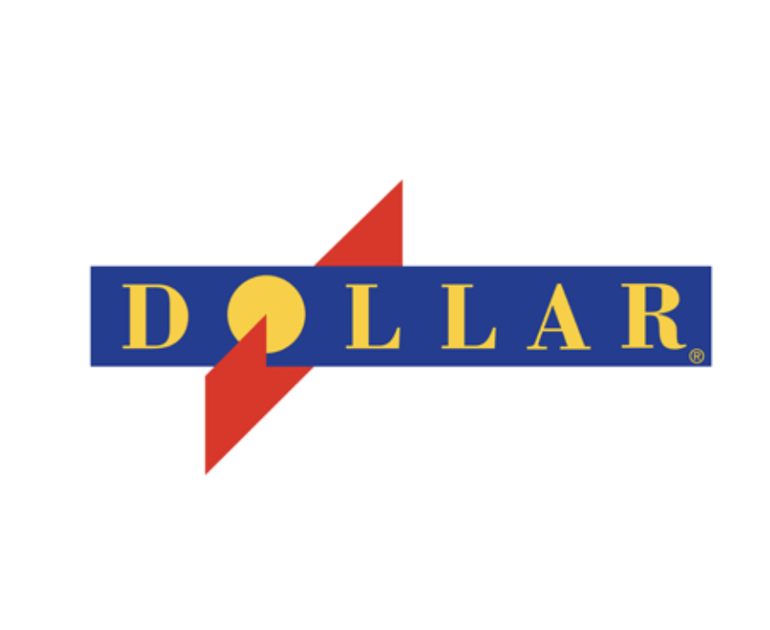
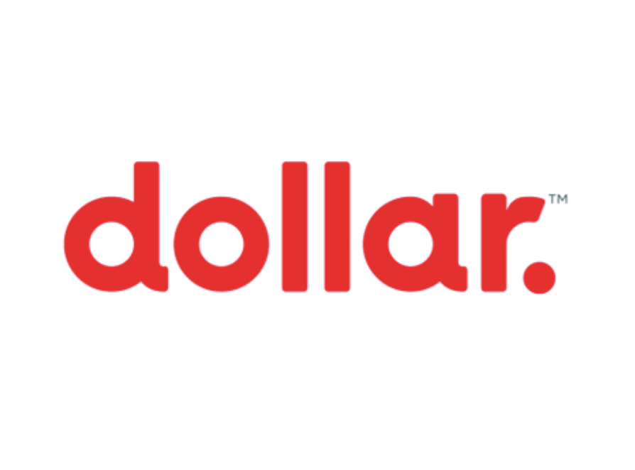
As I approached the rental car return area, I was bombarded with a multitude of signs and logos, making it challenging to locate the Dollar rental car sign. Unlike the other rental car companies, Dollar had their sign placed on the ground, which made it difficult to spot initially. Additionally, I couldn’t help but notice that the Dollar logo had undergone a recent change. Previously, it featured big, bold letters that were easily distinguishable from a distance. However, the new logo now displayed the Dollar name in small letters, which made it harder to read, especially when drivers are distracted by other signs and logos.
Readability Matters: When it comes to signage and logos, readability plays a crucial role in ensuring a seamless and stress-free experience for customers. Rental car return areas are often bustling with activity, with drivers trying to navigate their way back to the correct company. In such situations, clear and easily identifiable logos are essential for customers to quickly locate the appropriate rental car company.
It’s no secret that drivers can be easily distracted, especially in high-traffic areas or when searching for specific signs. The purpose of logos is to stand out and provide clear guidance amidst these distractions. The previous Dollar logo, with its big and bold letters, effectively served this purpose, capturing attention and helping drivers identify the rental car company without confusion.
A sudden change in logo design can also lead to confusion for customers who are familiar with the previous branding. When rental car companies opt for significant logo transformations, it becomes essential to strike a balance between modernization and maintaining brand recognition. While it’s understandable that companies may want to refresh their image, it’s crucial to consider the impact of such changes on customer experience and ease of navigation.
Returning a rental car should be a hassle-free experience for customers. I’m not exactly saying that the new more subdued logo is inferior to the previous one. But since it’s subdued, they should display their sign more prominently. Clear and readable logos play a vital role in facilitating this process, particularly when drivers are distracted by other signs and logos. In the case of Dollar rental car, the recent change to a smaller and less visible logo may have unintentionally added stress to customers’ rental car return experience. As rental car companies continue to evolve their branding, it is essential to prioritize legibility and visibility to ensure a smooth and pleasant experience for all customers.
Yeah i kinda see your point. The new dollar logo does not stand out as much as it used to. Don’t get why they changed